IFS Web Business Graphs
The graph screen shots should (probably?) be updated.
This document is a guide to develop business graphs for IFS Web Clients.
This documentation assumes that the reader is already familiar with the IFS
Web Client concepts and has a basic knowledge about mechanisms and developing of
pages. For more details refer the IFS Web Client Developers Guide and the Portal
Developers Guide. The reader should already have a basic knowledge about Java.
Graphs
No third party graph product is bundled into IFS Web Client.
Instead we decided to support some basic graphics directly from the IFS Web
Client
framework. This support consists of a series of java classes supplying an easy
interface to create and deploy graphics that visualizes the data from a query.
This product generates a picture file in PNG (default) or JPEG format on the
web-server. The picture name is generated and unique. About
100 pictures can be generated in one millisecond. The picture will be valid on the
web-server for ten minutes and is then deleted.
How to create a graph
Instantiating
First an ASPGraph object must be instantiated.
Use
| graph = new ASPGraph(mgr, ASPGraph.chart_type); |
Where mgr is ASPManager object and chart_type is one of the supported types.
Supported types in IFS Web Client:
| Chart Type |
Description |
Example |
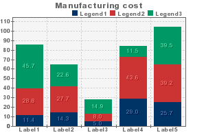
| COLUMNCHART |
The most common Chart type with vertical bars. The bars can be
outlined and there is a special mode where each bar has a unique color.
(columnColorMode) Good for data with only one series.
This chart type can show overlay lines on top of the bars.
Value labels can be shown for each bar. |
 |
| LINECHART |
Simple lines. Can start from the edge or can be centered over each
value. The values can be marked with different marks. (circle or square)
Overlays is possible but not needed.
Value labels can be shown for each mark. |
 |
| STACKEDCOLUMNCHART |
Bars on top of each other. If you want relative values you can always
recalculate the values to percentages before you populate.
This chart type can show overlay lines on top of the bars. |
 |
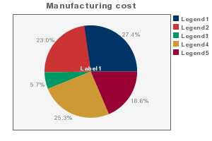
| PIECHART |
Show relative data in pies. Many pies can be shown in the same
picture. One Pie for each series.
This chart type can not show overlay lines. |
 |
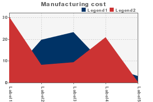
| AREACHART |
This is very similar to the line chart but there are filled areas
below each line. Overlay lines are possible. |
 |
| STACKEDAREACHART |
Areas on top of each other. If you want relative values you can always
recalculate the values to percentages before you populate. Overlay
lines are possible. |
 |
| NEGATIVECOLUMNCHART |
Obsolete, same as COLUMNCHART |
see COLUMNCHART |
| NEGATIVELINECHART |
Obsolete, same as LINECHART |
see LINECHART |
Configuration
After the Graph has been instantiated the object should be configured. Use
different methods to alter the appearance of the result. All of them are listed
in the Java DOC but some of the most important ones are listed below. Every
setting has a default value and in most cases this is adequate. It will look
good without any changes, but when special appearance is desired many things can
be modified. See Graph Properties.
Some of the major parts of this phase is.
- Creating titles
- Setting colors
- Adding labels/legends
Adding labels/legends are actually better to do when you populate data.
Data Populating
When all properties are configured it is time to populate the data. This can
be done with three different techniques. They are all dependent of the fact that
the data is stored in a matrix. Data points are stored in columns and data sets
in rows. Normally data from the same set has the same color. But this is
configurable, at least for column charts. If no data is populated the chart will
show both axis but no bars, lines or pies. Normally the max value of the chart
is set to the maximum value of the populated points but if no point are
populated the max value is set to 100. It can of course be set explicitly.
Overlay data must be populated in to a separate matrix using setOverlayDataAt().
To populate data into the graph matrix use one of the following methods of
the ASPGraph object.
graph.setDataAt(Row,Column, Value ) |
The value must be a double! This method is recommended and well
tested. It places the data directly at the specified position in the
matrix. Easy to use in normal LOOP statements. |
graph.setData( Column, Value ) |
The value must be a double! This method will place the data in the
specified column in the current row. Current row can be set using
setThisSet(). Use this method when only one series exist or when it
makes the code easier to understand. |
graph.setQuickData( data ) |
This method is able to populate data that is TAB-separated '\t'. Each
row must be separated with a newline '\n' character. Data is a normal java
string. Use this method only if you have the data stored on an imported
format like a text file or similar. |
Creating the Chart
When the data is populated and all the properties are set the chart is ready
to be created. You can create the chart explicitly with the drawGraph()
method and then get the filename from the getGraph() method. Or you can call
getGraph() directly since it will call drawGraph() if it hasn't been done already.
Later on the filename can be passed to the HTML generating method, for example
printImage().
Example:
...
ASPManager mgr   = getASPManager();
ASPGraph   graph = new ASPGraph(mgr, ASPGraph.COLUMNCHART);
...
<configure>
<populate>
...
beginTable();
// a good way to create and display a chart
printImage(graph.getGraph(),graph.getWidth(),graph.getHeight());
endTable();
...
Graph Properties
Each property should be set using it's corresponding method. Many but not all
can also be extracted using the get-method. Try to set everything before
populating the matrix. Unfortunately, it's not always possible to set properties
after the population.
Titles
Each graph can show three different titles, the main title and one on each
axis. It's possible to change the font face and size. The foreground color is
always used to write the titles. The text is not line wrapped. Please use short
informative titles. If more info must be provided, try to place this in HTML
outside the picture instead. Less titles provides more area for the graphics. By
default, no titles are shown.
I should also mention the possibility to add a small y-axis
description. This can for instance be units (kg, $, %) or maybe "in
thousands".
Useful methods:
graph.setGraphTitle(text )
graph.setLeftTitle(text )
graph.setBottomTitle(text ) |
These are the main methods used to set the titles. Each of them have a
corresponding setFont(font) method. |
graph.setYAxisDesc(text ) |
The Y axis description text. Font can be changed as well. |
Labels
You'll find the labels on the x-axis. They describe each point in the chart.
Since text wrapping is unsupported, make sure the text is as small as possible.
Sometimes it's even better to abbreviate the text.
In pie charts the labels are displayed in white (can be configured) on top of
each pie. If you only have one pie, it's better to omit the label.
The labels can be configured to tilt 0, 45 or 90 degrees. Use setLabelFormat().
But as default the tilt of the labels are some what intelligent. If the labels
are long they will tilt more. It's recommended to use this feature. Only use
setLabelFormat() in certain cases.
It's possible to add as many/few labels as you like, but no more than the
maximum of the populated point will be shown.
Useful methods:
graph.setLabel(nr, text )
graph.setLabelFont(font ) |
It's easiest to set the labels when the data is populating. Just include
the setLabel() method in the loop. |
graph.setLabelFormat(ASPGraph.style) |
The style can be one of the following: BEST_FIT(default), HORIZONTAL,
VERTICAL or DIAGONAL |
graph.setLabelCount(nr)
graph.setLabeEvery(nr) |
Use these if you don't want to show every label. |
Legends
The legends describe the data sets. Each set has a unique color and the
legend shows some text next to a colored square (line, for overlays). It
should be short since no wrapping is supported.
By default the legends are placed over the chart but below the title. If the
legends can't fit, they are placed on the right side instead. If they can't fit
on the height either, it's best to increase the chart height or decrease the
legend font size.
Useful methods:
graph.setLegend(nr,text)
graph.setLegendFont(font) |
Legends is best added as you populate data sets. One legend for each
set. |
graph.setLegendPosition(nr) |
0 - Best place. (default)
1 - On the right side of the chart.
2 - On top and to the right.
3 - Inside the chart. (experimental)
|
Interval and Scale
The scaling is some what intelligent. The interval between each unit on the
y-axis is depending on the height of the chart, the presence of titles, the
maximum value of the data, etc...Therefore, it's possible to influence this
calculation in many ways. Both directly and indirectly. There are a couple of
ways to do this directly.
Useful methods:
graph.setMaxValue(value)
graph.setMinValue(value) |
These methods will force the extreme values of the chart. Make sure
Max>Min. |
graph.setInterval(value) |
A method to set the interval directly. |
graph.setUnitLabelFont(font)
graph.setUnitLabelSpace( nr_of_pixels ) |
These methods can be used to interfere with the scaling indirectly. The
latter one just adds a number of pixels on each unit label when the
interval is calculated. This will just effect the minimum space between
unit labels. Can be useful.
The rule is:
<minimum space> = <font height> + <label space> |
Overlays
Most of the chart types support overlay lines. The lines are similar to those
on a line chart and can for example be used to show target or median
values. Many of the properties of line charts effect overlays as well.
Overlays must be populated separately. The overlays can be hidden but when
shown, they always show on top of the bars/areas. It's possible to show
unlimited number of overlay lines.
Useful methods:
graph.setOverlayDataAt(row,column, value) |
Populate data for your overlays. |
graph.setOverlayLegend(nr,text) |
Create overlay legends. If no overlay data is populated, no overlay
legend is shown. |
graph.setShowOverlay(show) |
Show or hide the overlay |
graph.setShowOverlayValues(show) |
You can control values for overlays separately. |
Value labels
To enhance the accuracy it's sometimes desirable to show small value labels
at each point. This can be done on every chart type, but by default this feature
is disabled. Use setShowVaules() to turn it on. There are a couple of methods to
control the way the value labels are displayed.
Useful methods:
graph.setShowValues(show)
graph.setValueFont(text) |
Turn values on/off and change the font. |
graph.setValueDecimals(nr_of_decimals) |
Set the number of decimals on value labels. Good for data showing
percent and calculated data with infinite decimals. By default, dynamical
number of decimals is turned on. |
graph.setShowOverlayValues(show) |
You can control values for overlays separately. |
graph.setValueColor(color) |
Use this method to force the color to some value. If left alone the
values will try to be readable. In some chart types, the value label has a
drop shadow to enhance readability. |
graph.setShowPercent(show) |
Works only on pie charts. It will show the percentage value of a pie
slice instead of its actual value. |
Colors
Almost every color is possible to change. The foreground color is used to
draw axis, titles and graph outline. There are two background colors: one
outside (graph background) and one inside (chart background) the outline. The
grid and pie labels has special colors. There are methods to set all these
colors.
The color palette for the graphics can also be configured. There are four
different color palettes to choose from and it is recommended that you use them.
But it is also possible to set every color separately. In that case use the
following example.
Vector colors = new Vector();
colors.add(new Color(255,0,0));
colors.add(new Color(0,255,0));
colors.add(new Color(0,0,255));
ASPGraph.setColors(colors);
Useful methods:
graph.setGraphBackground(color )
graph.setChartBackground(color )
graph.setGridColor( color )
graph.setForeground( color )
graph.setColumnOutlineColor( color )
graph.setPieLabelColor( color )
graph.setValueColor( color ) |
Methods used to set different colors in the graph. |
graph.setPalette( palette_nr) |
There are 4 different color palettes.
1 - Excel like.
2 - IFS module chart colors. (default)
3 - Gray Scale.
4 - Red, green and blue. |
graph.setLightness( value ) |
Use this to lighten up a palette. A negative value will darken the
palette instead. Value can vary from -255 to 255 |
graph.setWebSafeColors(set ) |
If this method is used, palette will be rounded to web safe colors.
(doesn't work for hard coded colors) |
Grids
In the back of the graph, gridlines can be drawn to make it easier to
understand and read the chart. These can be modified a bit to enhance
readability in different conditions.
Useful methods:
graph.setShowGrid(show ) |
Methods used to turn grids on(default) or off |
graph.setGridOnTop( on_top ) |
Set this to place the grid on top the data graphics. Good for area
charts with large areas. |
graph.setGridOptions( ASPGraph.option ) |
There are some options for grids. The different options are quite self
explaining.
NO_GRID, FULL_GRID, HORIZONTAL_GRID or VERTICAL_GRID |
graph.setGridColor( color ) |
Make sure the color has contrast to the background |